
BOOK COVER DESIGN: PART 3. COMMON ARCHETYPES IN BOOK COVER DESIGN
Welcome to Part 3 of my book cover design series of articles. In this article I will be concentrating on archetypes in book cover design. Some border on the cliché, but it is important to state that archetypes are there because they work! As I mentioned in Part 1, many blockbuster movie posters are archetypal (especially those using the Orange and Teal colour scheme). The truth is, never be too intricate or elaborate. The best book covers will always be those that are cleverly simple-stupid. In part 1, I designed a book cover titled The Red Admiral. It was very simple, but very powerful (in my opinion).
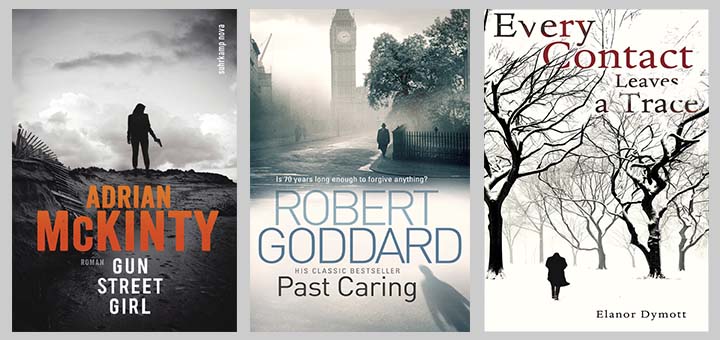
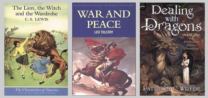
The first archetype is the use of silhouettes. Often this includes just a human figure or two. Adrian McKinty’s book covers often feature silhouettes, as do Robert Goddard’s. Below are three well-known books using silhouettes:
I use silhouettes sometimes. Their strength is that that indicate mystery and anonymity. All great stories must have a strong element of mystery and suspense. Hopefully the reader will find the suspense in the novel. Notice that mystery deals in the past (what has happened in the past), whereas suspense deals with the future (what will happen next). Here are three book covers of mine that use silhouettes:
Finally, it should be noted that sometimes only a partial silhouette is used with only a slither of sight of the figure viewable.
And please consider that the silhouette can be the basis of the entire cover. Some of my favourites are given below:
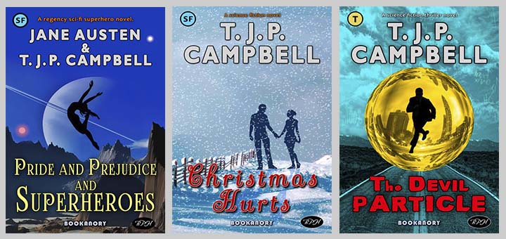
Below is a book cover I have done that is based on silhouettes (the text font and genre icon and extra description all indicate to the reader that we are in the sci-fi genre):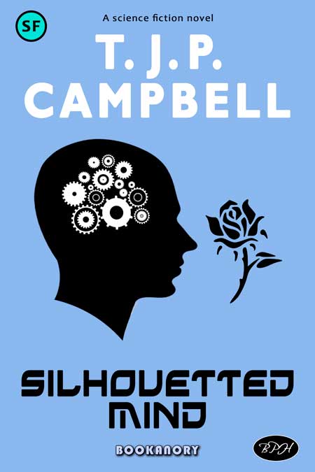
Silhouettes don’t have to be black and white. They basically represent cut-out card (which of course can be coloured). The name originated from a French guy, Mister Silhouette, who was associated with the highly popular activity of cut-out card design. Below is a coloured arty version of the book Silhouetted Mind: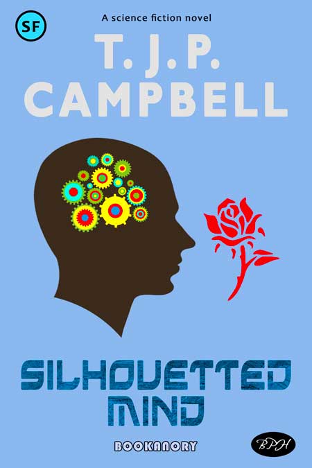
Other archetypes are a human with an animal. In sci-fi, often a woman with a large catlike creature or a dragon. Or a human and a horse is common. Here are some examples:
Woman and man in loving or deadly embrace:
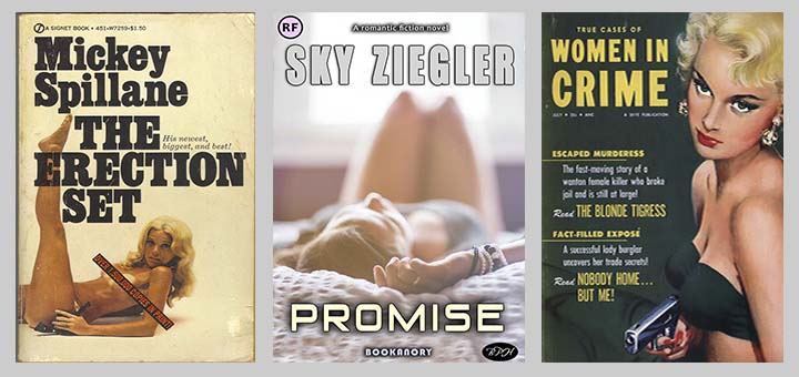
Human sexuality through flesh on show (cleavage or legs):
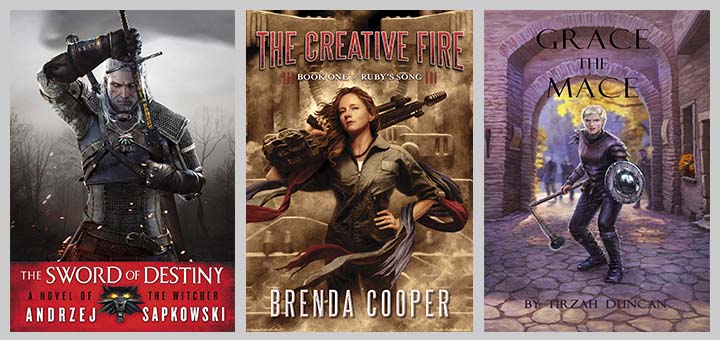
Then we have a human with a weapon (sword, gun commonest):
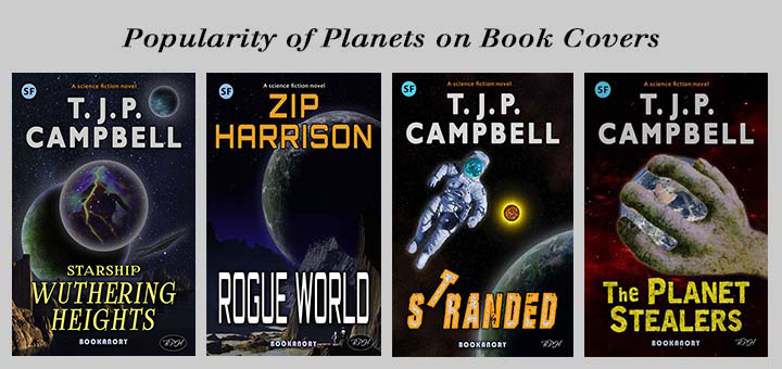
Planets are often shown in sci-fi book covers. I will be describing the design of planets in a later Part of these book cover design articles. Examples from my own books include:
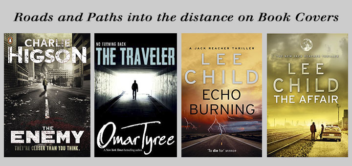
Roads and Paths into the distance (see Lee Childs for a lot of these roads and paths; also I did one in The Devil Particle shown at the beginning of this article). Crossroads, railway tracks and infinite staircases are also related to this archetype. Examples include:
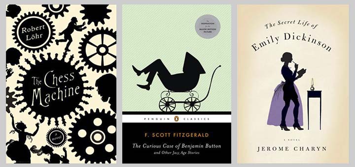
One popular archetype design method is to do something clever and simple with the text title. For instance, in one word title you could consider making the word resemble the object of the title. I call this the Words Incarnate Method. To show what I mean, here are three famous book covers:
Also in this vein, clever manipulations of letters within a word, or perhaps a whole word, in the sentence of the title can often attract the potential customer to look further: Here are three of my book covers to demonstrate:
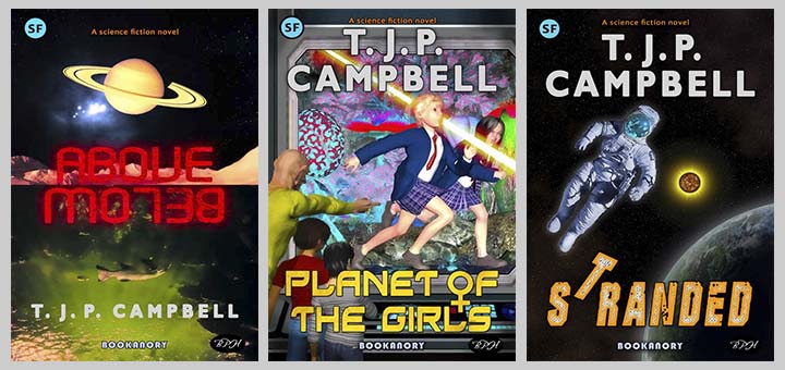
Notice in Above Below the words divide the book cover into two opposing up and down halves. Perhaps the novel will be concerned with an adventure in a distant underwater planet. An interested browser might look for the blurb to find out. In the middle book, I manipulated the letter “O” to double up as the symbol for the female gender. And lastly, the book on the right uses a simple manipulation of movement of the letter “T”. Notice how the letter “T” now duplicates the orientation of the (presumably) stranded astronaut.
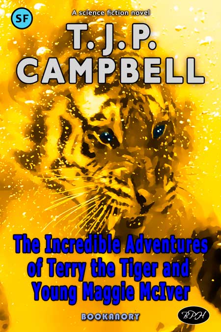
Finally in this archetype of design, I will mention that words can be manipulated cleverly to perhaps look more aesthetically pleasing. For example, consider the book cover I showed previously of Terry the Tiger and Young Maggie McIver:
The title is very long. So I think it can be improved by only keeping the important words a large size. I think colourising the image would be helpful too. So how about this?: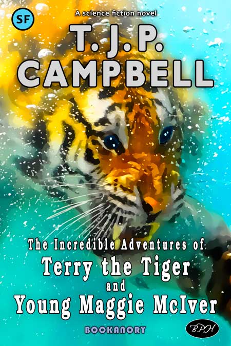
Yes, that is now a reasonable book cover. You can make words go vertical, put them in arcs or circles, change their fonts and colours. Anything you like, but as always, don’t overdo it!
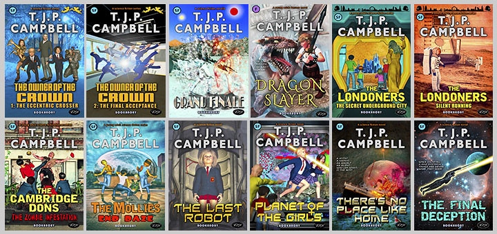
The last archetype design method I shall mention is the use of 3D software such as DAZ Studio, Poser and Blender. Basically you can create a set of characters and images for your book covers (useful for a series–think The Famous Five by Enid Blyton). If nothing else you can use basic figures and clothing to create silhouettes. This means learning how to use such programs (no easy task). I use DAZ Studio (its free as are some of its basic characters). In Part 2 I showed my four book series Britland Calling. I used DAZ to create all these covers. It would have been difficult to find photographs for such book covers. As the books are intended mainly for Young Adults and children, the bright colours and extraordinary characters fare well using DAZ Studio. Here Are twelve more book covers where I used DAZ Studio:
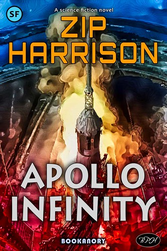
You might consider using a public domain photograph and using photoshop to create an artistic standout book cover. Below I used a well-known Apollo 11 image and used it as a basis to produce an artistic lively book cover:
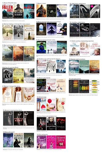
And there are many other common systems of composing book covers. And although there is some overlap, I recommend you read Luke Lewis’ 19 Book Cover Clichés. These 19 cliches are:
1. Scary silhouette man.
2. Woman holding a birdcage for some reason.
3. Man lurking by fence.
4. Woman in long white dress.
5. Woman in long backless dress.
6. Bloke with sword.
7. Bloke in hood.
8. Bloke wearing hood and carrying sword.
9. Woman looking out over water.
10. Shadowy man walking into the distance.
11. Woman with luggage.
12. Woman’s legs.
13. Lots of black and red. Gothic font.
14. Pink and sparkly.
15. High heels, muted tones.
16. Jewellery, muted tones.
17. Child’s sad face, handwriting-style font.
18. Spooky road to nowhere.
19. Just some leaves.
So if you want to design your own book cover use the KISS approach (Keep It Simple Stupid). Choose an archetype/cliche or two and combine everything into a pleasing design. Bear in mind your colour scheme and stick to no more than three main colours. Make sure your cover is not a true cliche even if it uses such a construct. Think of your book and maybe you can think of a scene that intrigues the reader (in Harry Potter Book 1 The Philosopher’s Stone, most covers show Harry at platform 9 3/4. This image is enough to interest the reader. Whatever you do, don’t show an image that gives a spoiler to the story! Think of a pop song. It works if it is familiar enough yet unique enough to entertain in the genre in which it is written. You can only break rules of design when you understand them.
The only book cover design mortal sin is to produce an identical book cover. If you use a public domain or copyright free image, I would suggest you do a good job of manipulating it so that it is bound to differ from book covers using the same image. So for a silhouetted figure you could use the warp function and say a flip in the vertical or horizontal axis. You can also give the image a tinge of dark colour. In the example below, I used reflection, I added a darkened tinge of colour, I used warp to change the shapes of the characters, I directly manipulated the silhouette to remove the hat of the woman, lengthen the skirt of the girl and remove the quiff on the man’s hair. I also added some shadows by implementing a duplicate silhouette, flipping it in the vertical axis and finishing the process off by adding a gradient blur. See if you can spot all the subtle changes:

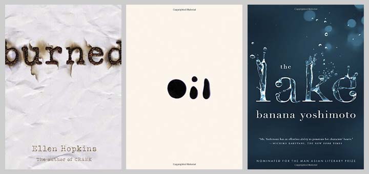
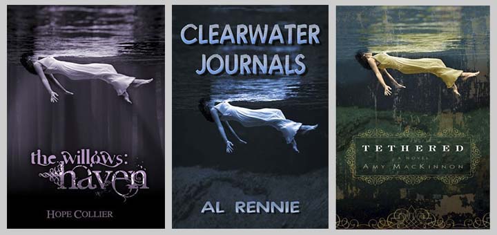
For main background well-used images you could add fog, snow, rain, storm, colour washes and gradient fade, warp, resize, perspective and artistic filters (such as HDR, cartoon etc). And if you don’t believe an image will crop up more than once, consider the trio of books below:
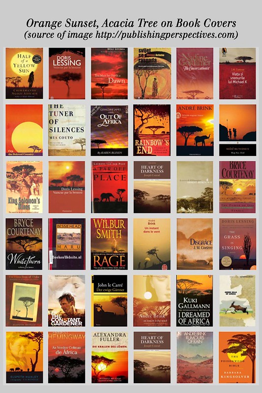
Cliche, Archetype, meme: they all have something in common. Sometimes when we publish a book we take account of the reader’s understanding of the associated culture. Consider African stories. We commonly see an orange sky and an acacia tree, or possibly some wild life strolling the wild countryside. Look at the examples below:
Finally, I would strongly advise an author planning on designing a cover for their book to look at many other covers in their chosen genre (just google book cover images). It’s best to stick to what works. Try to simply do a better job than the covers you examine. I’m pretty sure you can at least produce covers indistinguishable from Lee Child book covers (if that is your genre). And remember to choose the most suitable colours for your genre as the cover must be indicative of the genre. Avoid using 3D software if you want to save time. If possible use photoshop or Gimp and learn its basic functions. For further information try Derek Murphy’s articles (there are some on http://diybookcovers.com).
That’s it for this part. And now onward to Part 4 where we will look at the main aim of a book cover.


